DESIGN LEAD, BRAND STRATEGY, ART DIRECTION
Collateral for Lulu, an internal enterprise tool for Agoda's supply partners.
ABOUT
The product and partnership services team came together to redesign Agoda’s internal UX & UI in their existing enterprise tool (YCS). With this, and the possibility of extending this tool to other Priceline companies, also came the need of creating a new identity with the potential to scale independently.
Process
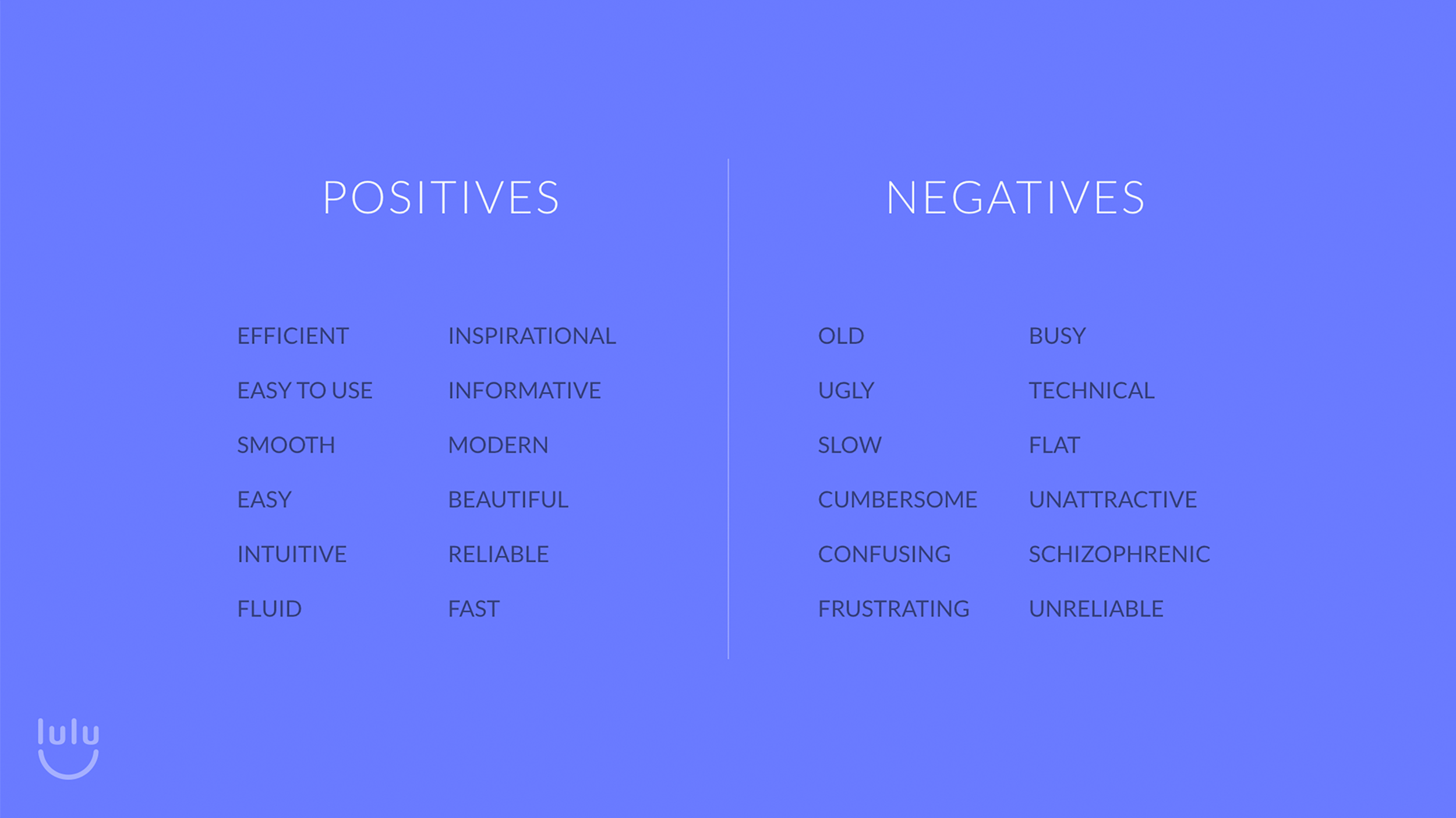
Brand mapping, charts, and surveys were sent out to establish a direction.
Brand
Lulu’s stationery application, as proposed for the Agoda + Priceline usership.
Elements
One of the biggest challenges for establishing an identity, was to simultaneously reconcile simplicity and ease of usage, while still retaining some of Agoda’s brand components, which had been established long before. The name Lulu came to be, with future projection of the product becoming more of a friendly personal assistant AI platform for properties and small hotels.
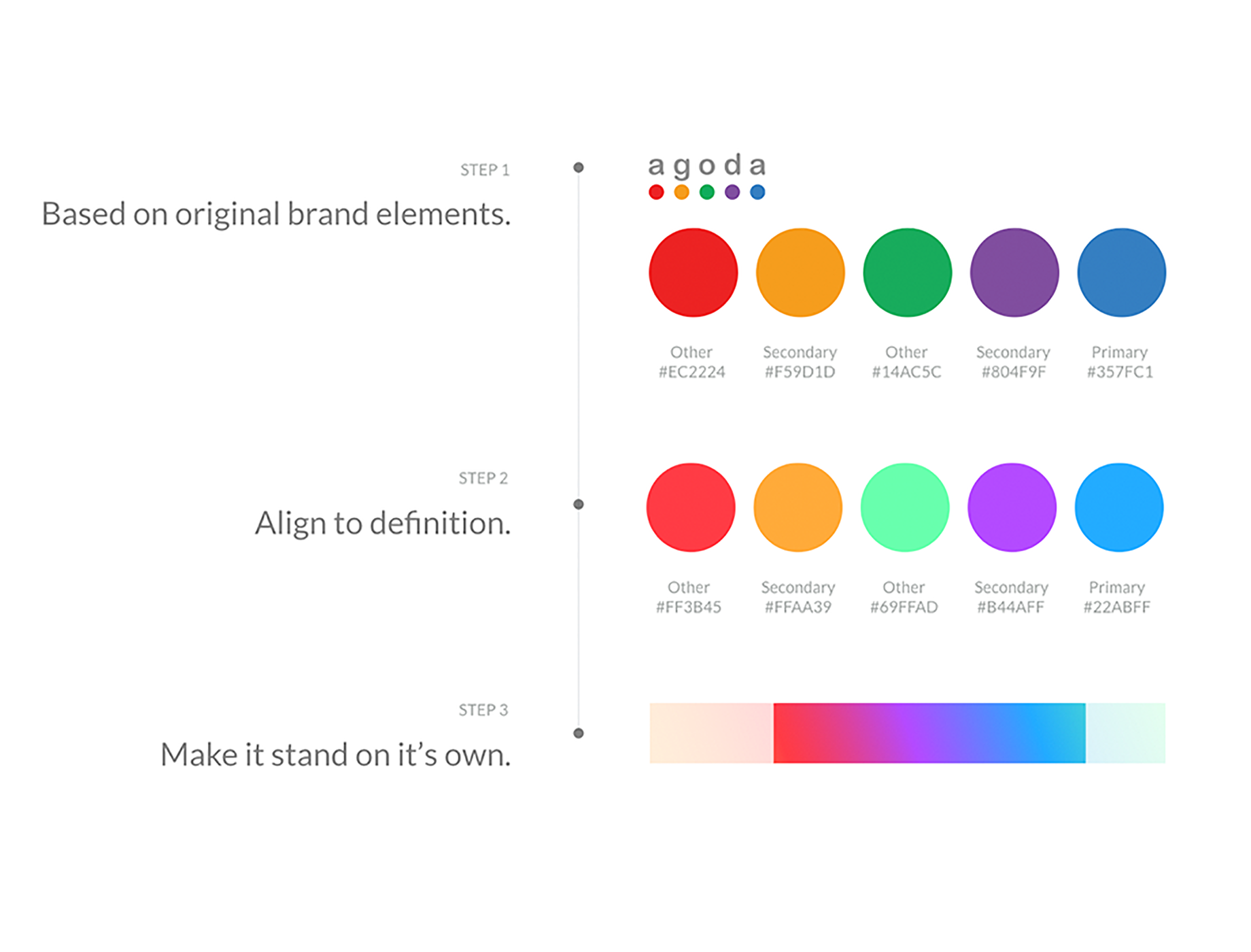
Lulu’s palette was established by augmenting the saturation of Agoda’s brand colors, and then extracting a gradient from the blended spectrum.
Product
When redesigning any brand, it can often be challenging to incorporate some of the off-digital brand elements into the digital product. Often in rebrand processes, these are looked at separately and by different teams altogether. Fortunately enough, we structured the team to work in tandem and collaborate through every step. This allowed for early validation and spotting any flags to modify and adapt early in the process.
Lulu’s screens depicting product features and capacities.
The color palette proved to scale sufficiently into basic UI elements, as well as others more complex like analytics dashboards.
Some illustration elements using our gradient color palette added a level of friendliness to an otherwise purely utilitarian platform.


